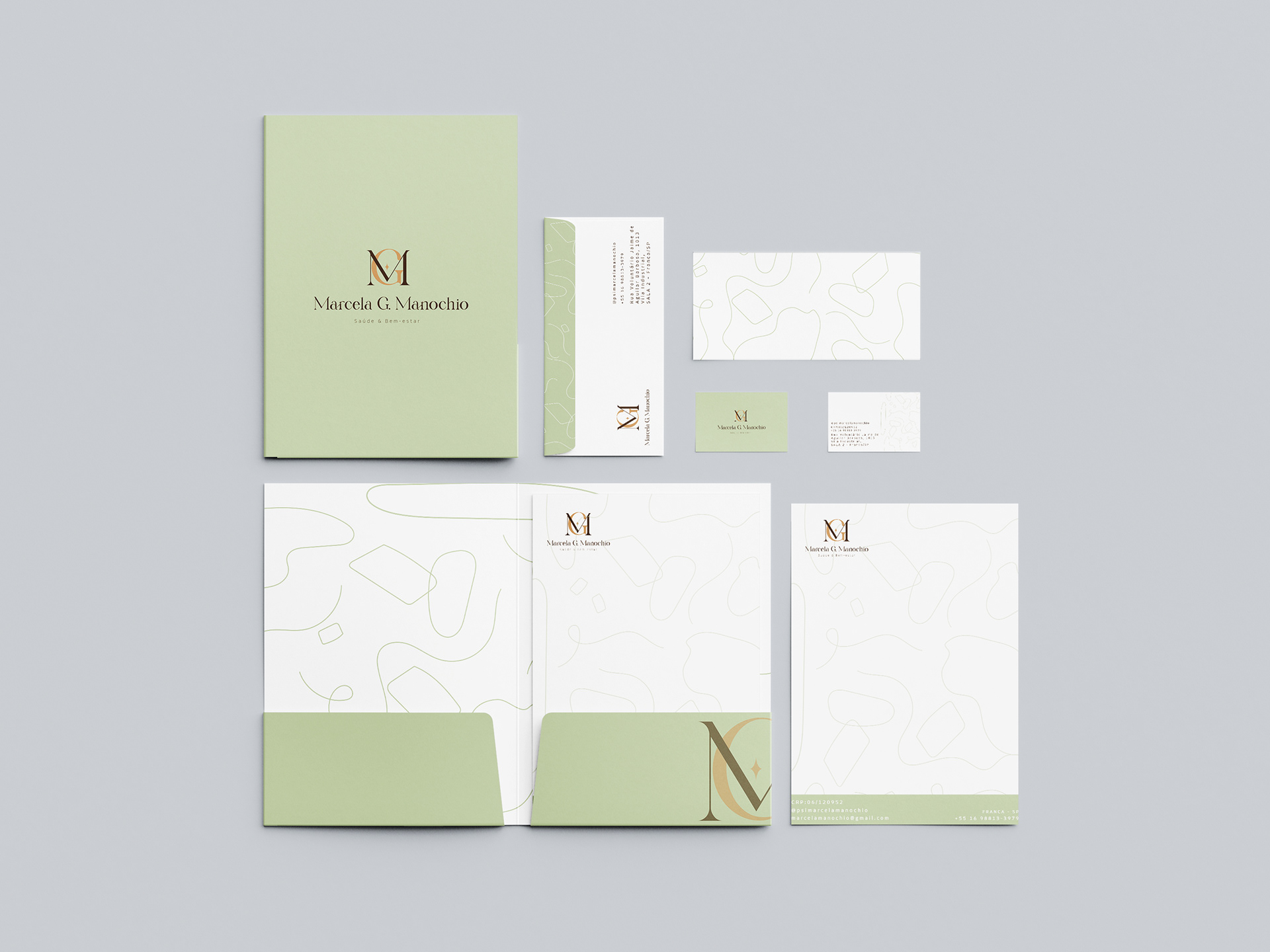
Visual identity for a therapist. She is based in Brazil and specializes in eating disorders and kids. Based on the information client provided I decided to create a logo simple yet modern, sophisticated, timeless, and comforting.


This Brand Identity was very well thought out to express exactly the client's needs. The pastel green brings us peace, serenity, harmony, emotional balance, and health which has a lot to do with a therapist's job. The nude means elegance, timelessness, modesty, and sophistication. The brown means strength, trust, and safety.
I decided to add an abstract pattern for her brand, the idea of the loose and unorganized strokes and bubbles was to represent our confused thoughts.
